A Pearl, Not a Letter
Company
Centeni
Position
Founding Designer
Industry
Healthtech
Platform
Brand
When André Leite and Felipe Cabral brought me on to create Centeni's identity, the first thing I did was ask them how the company would feel if it were a physical space. I wasn't asking about the business. I was asking about taste. The answer reveals more about what a brand needs to be than any formal brief ever could.
They described something refined and distinctive. Contemporary Brazilian: not imported, not generic, not safe. It became clear that Centeni's identity would need to carry surprise. Something you wouldn't expect to find in a health product.
Before any shape was drawn, I made a decision that would define the entire project: we weren't going to start with the logo. I argued that more valuable than the symbol is the story you tell. The story is what perpetuates the brand's value. Good storytelling isn't about communicating: it's about creating a cultural instrument that aligns teams, inspires decisions, and unites everyone around the same purpose. The founders agreed. The story came first.
Centeni's founding story begins with the places where people live well past 100 with autonomy, vitality, and a low incidence of chronic disease. They're called Blue Zones, a term coined by researcher Dan Buettner together with National Geographic after identifying five regions with lifestyle patterns capable of significantly extending human life. Buettner circled these regions on a map with a blue pen. Hence the name.
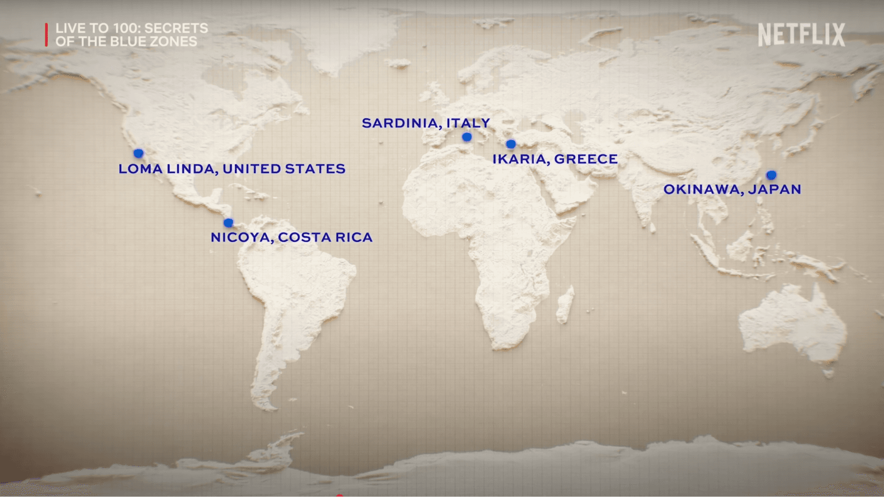
Map of the world's five Blue Zones, from the Netflix documentary Live to 100

Three centenarian women in Okinawa, Japan
Centeni set out to be a digital Blue Zone: a place that guides each person toward their best self at 100 years old. Bringing that world into the narrative was my initiative: the conceptual anchor that would justify every visual decision that followed.

An elderly man in Sardinia, Italy
The symbol that first won us over was a C shaped like an emblem, like an old stamp. The logic was elegant: C for Centeni, but also C for 100 in Roman numerals, the number that defines the company's goal. The emblem also resonated with the pillar of scientific rigor: the idea of a brand as a seal of what's clinically proven.
What made me abandon it was realizing it couldn't expand. A symbol needs to be capable of becoming a system, it needs to carry enough color, shape, and concept to evolve beyond itself. The C-as-emblem didn't have that potential. I killed the idea. It was the right call.
I worked from four criteria I defined before exploring any shape at all: the symbol had to be inherently valuable from the start, generate immediate attraction, spark desire, and inspire trust. That's how I arrived at the pearl.

"The pearl symbolizes what we hold most valuable and precious: our health. It's not just beautiful, it expresses the value of health itself."
The pearl is blue because it's a Blue Zone. Blue was the color Buettner used to circle the regions of greatest longevity on the map. By adopting that blue, deep, luminous, ranging from navy to near-white, the pearl carries the chromatic memory of the Blue Zones within itself.
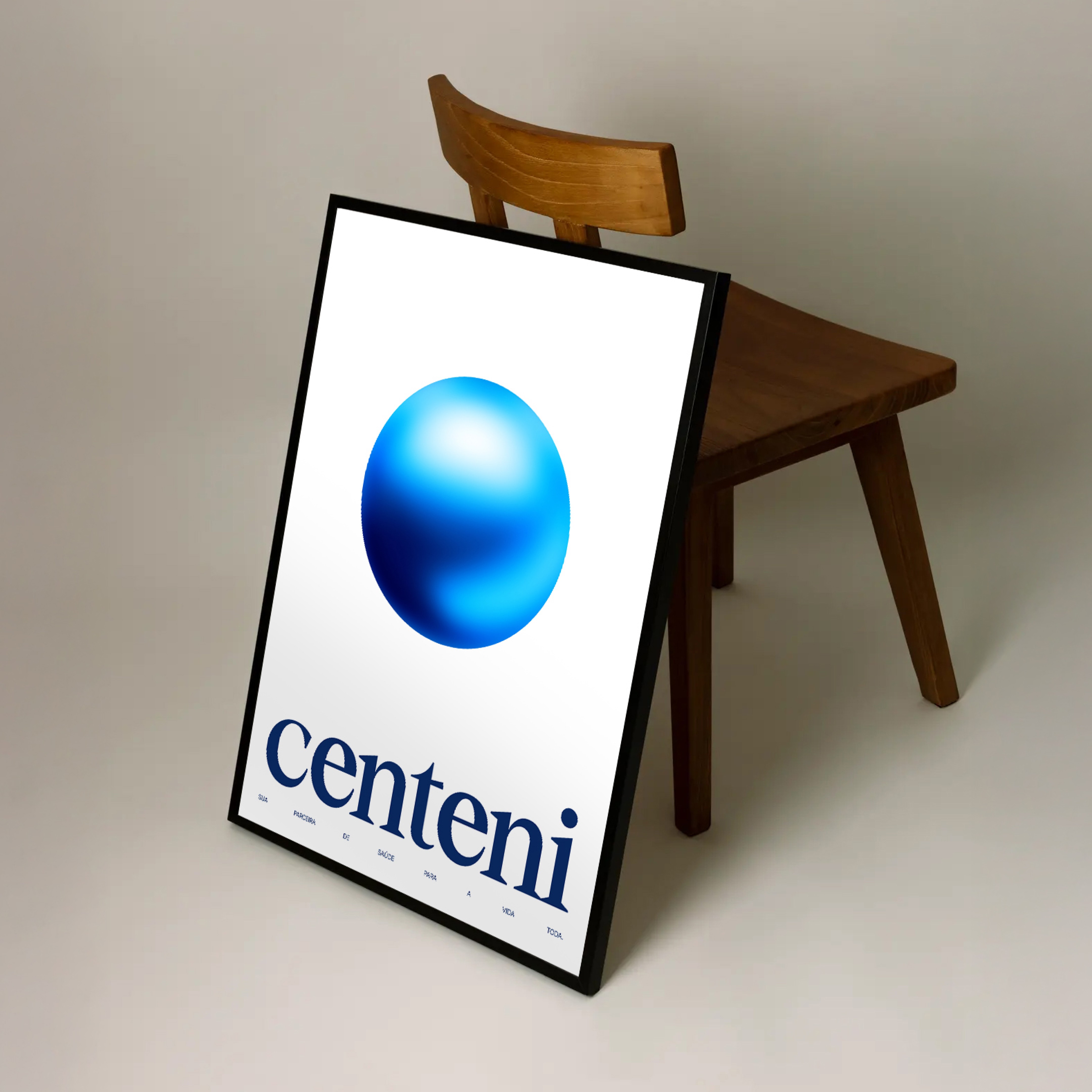
Printed poster.
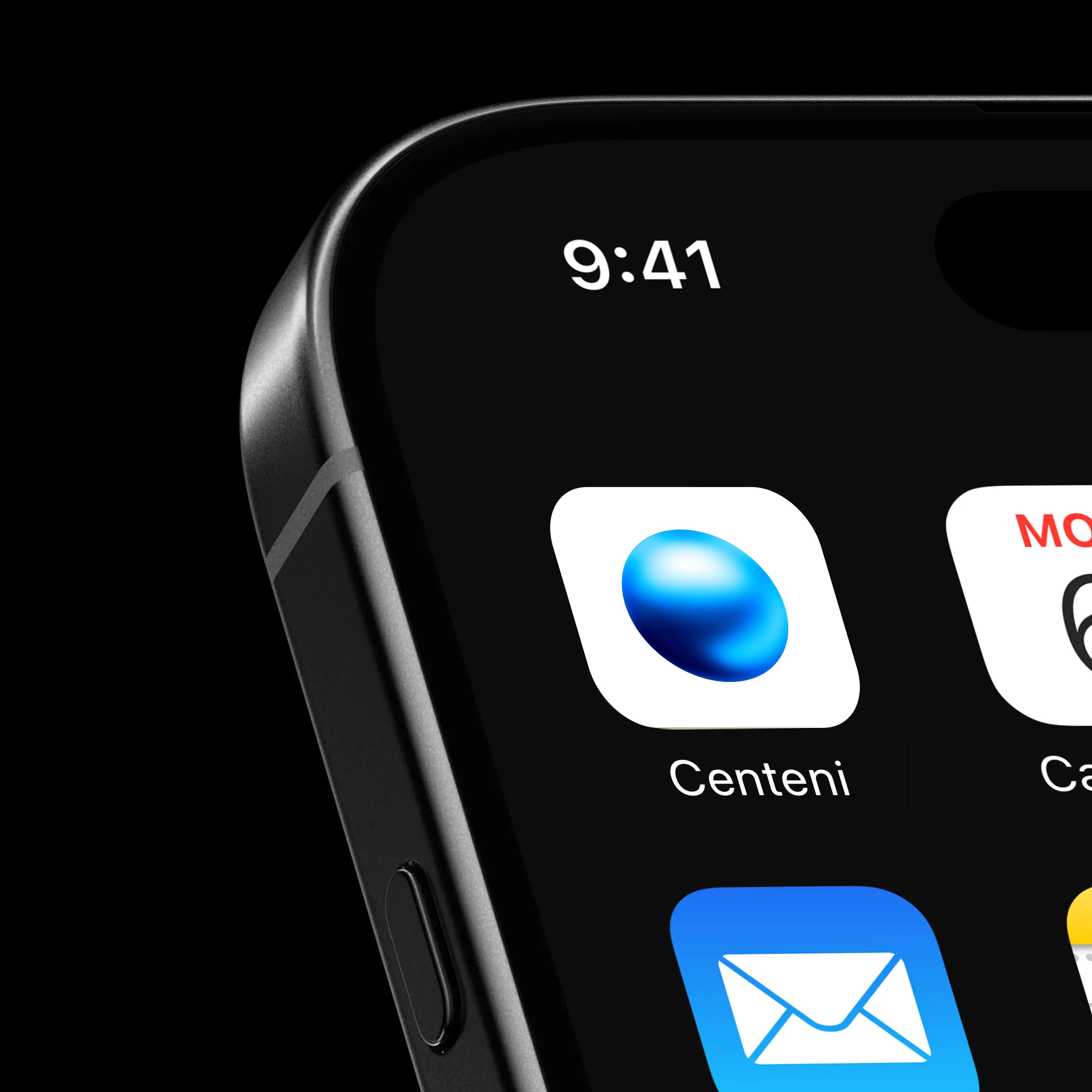
App icon.

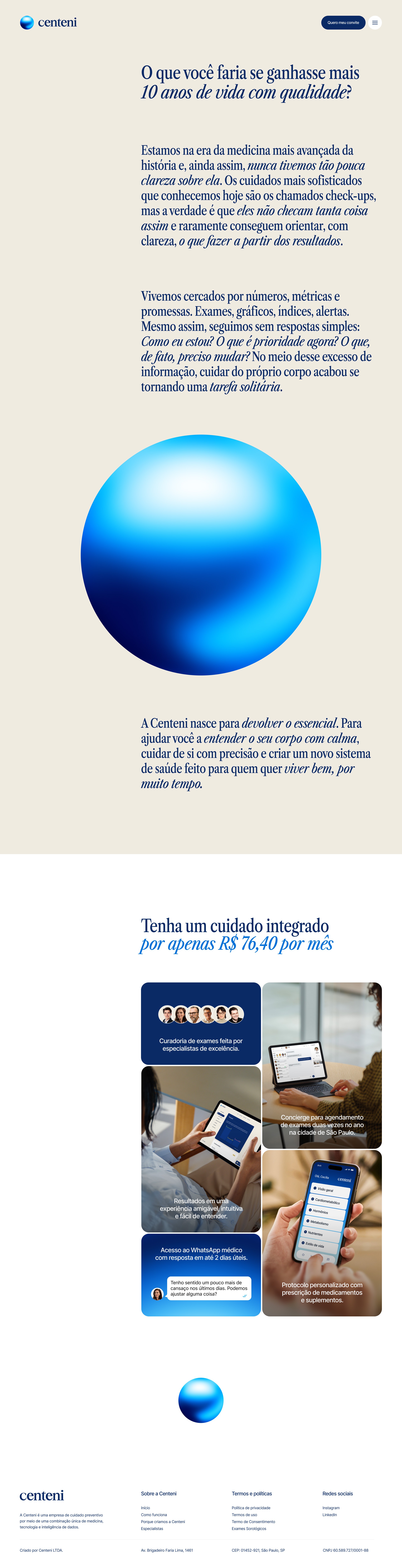
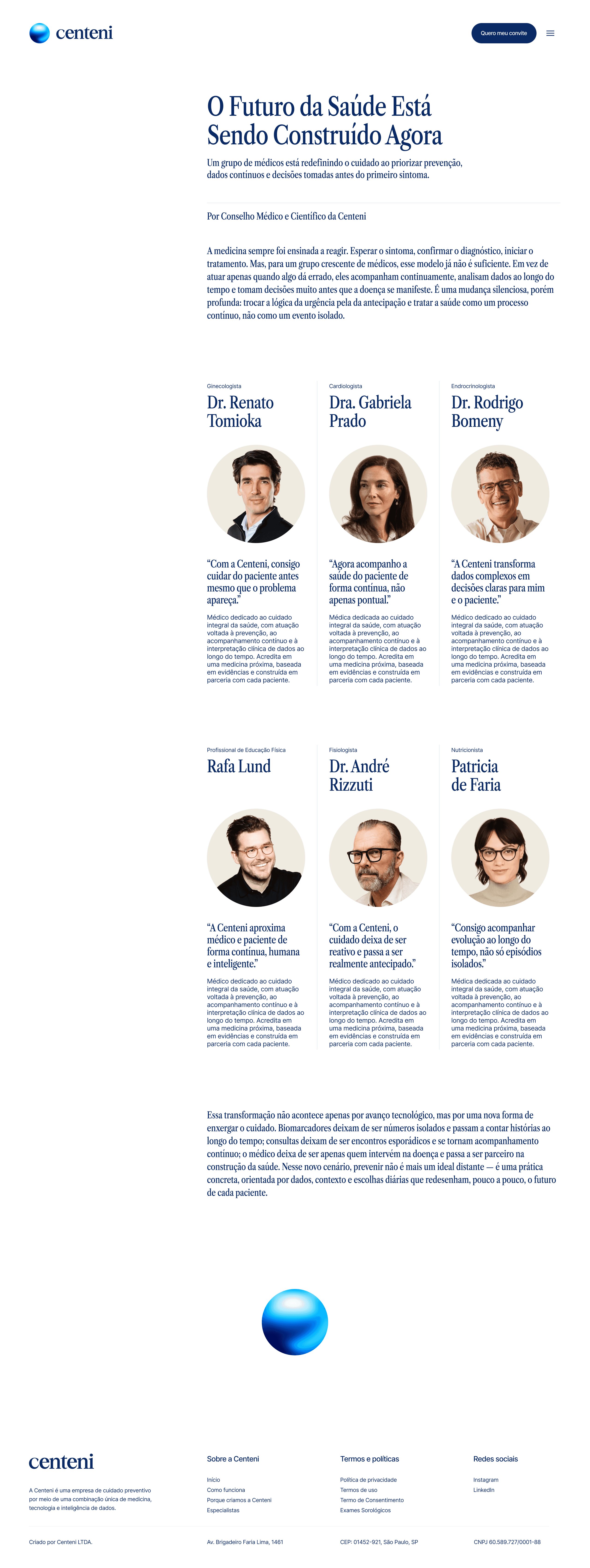
The centeni.com.br website in use. The pearl as the homepage hero.
When I first showed it to the founders, they asked to see the pearl rotating on its own axis, to exist in three dimensions. That was the moment I understood the symbol had worked: the client didn't want to understand the pearl. They wanted to touch it.
The typographic choice wasn't aesthetic. It was historical. Caslon was created in 1720 during the Enlightenment, used in the first medical encyclopedias and anatomical atlases. For a company built on "rigorous science," using Caslon isn't decorative: it's semantic. The typeface carries three hundred years of scientific authority in every glyph. The version we chose was Libre Caslon Condensed from 2023: condensed letterforms, editorial impact, the tension of a manifesto paired with the lightness of an invitation.

Cyclopaedia, 1728. Caslon as the typeface of science since the Enlightenment.

Poster.
The lowercase serif wordmark completes the equation: the lowercase invites, the serif lends gravity. Friendly seriousness, something few health brands manage to pull off.

Poster.
We delivered the symbol, logotype, typography, palette, and initial applications. The brand manual came later. We needed to see the symbol perceived and received in the real world before writing the rules of a system. The manual would be built on top of application, not ahead of it.
Here I should be honest about a rule I broke: 2D symbol, solid colors. The pearl violates this: it's three-dimensional, carries a wide range of gradient tones, and creates real problems in physical media. That decision was made because Centeni is a digital-first company.