One Number: The Home Screen of a Preventive Health App
Company
Centeni
Position
Founding Designer
Industry
Healthtech
Platform
Mobile
Desktop
When I left Itaú Empresas to join Centeni as founding designer, the company had a very well-defined thesis and almost no product. The founders knew exactly what they wanted to change about preventive medicine in Brazil. What they didn't have was the interface between that thesis and the people who needed it.
The problem wasn't the medicine. It was what happens after the exam. When you get a PDF of your lab results back, it's almost impossible to understand how healthy you actually are.
Dozens of black-and-white pages. Numeric values with no context. No summary, no hierarchy, no answer to the simplest question: am I okay? Centeni wasn't built to improve the PDF. It was built to eliminate the need to understand it at all.
The product is a five-step journey. In the first step, a complete health form maps goals, disease history, habits, and nutrition. In parallel, a Centeni concierge schedules the blood work and goes to the patient's home; partner labs include Fleury, Alta Diagnósticos, Einstein, and Sírio-Libanês, with coverage across all of Brazil.

Health form – selecting the user's health goals.
In the second step, results arrive in a dashboard with a historical timeline, an ideal range, and a plain-language explanation of each biomarker.

Exam dashboard – displaying test results.

Exam dashboard – displaying health biomarkers.
In the third, a real doctor writes a personalized protocol, with their name, medical license number, and photo visible, answering three questions no PDF ever does: how am I doing, what should I prioritize, what should I do.

Health protocol – displaying medications and supplements.
The hardest decision was what to put on the app's home screen. The product had 87 biomarkers, a medical protocol, an AI assistant. Why show just one number?
The home screen needed to produce a single effect: make the user want to screenshot it and share it with someone.
The reference was Spotify Wrapped. The idea was for the home screen to work like a shareable card, information so personal that the first reaction would be to show it to someone else. That someone would become a potential user. Biological age was the obvious candidate: concrete, personal, surprising.

Home screen – displaying biological age.
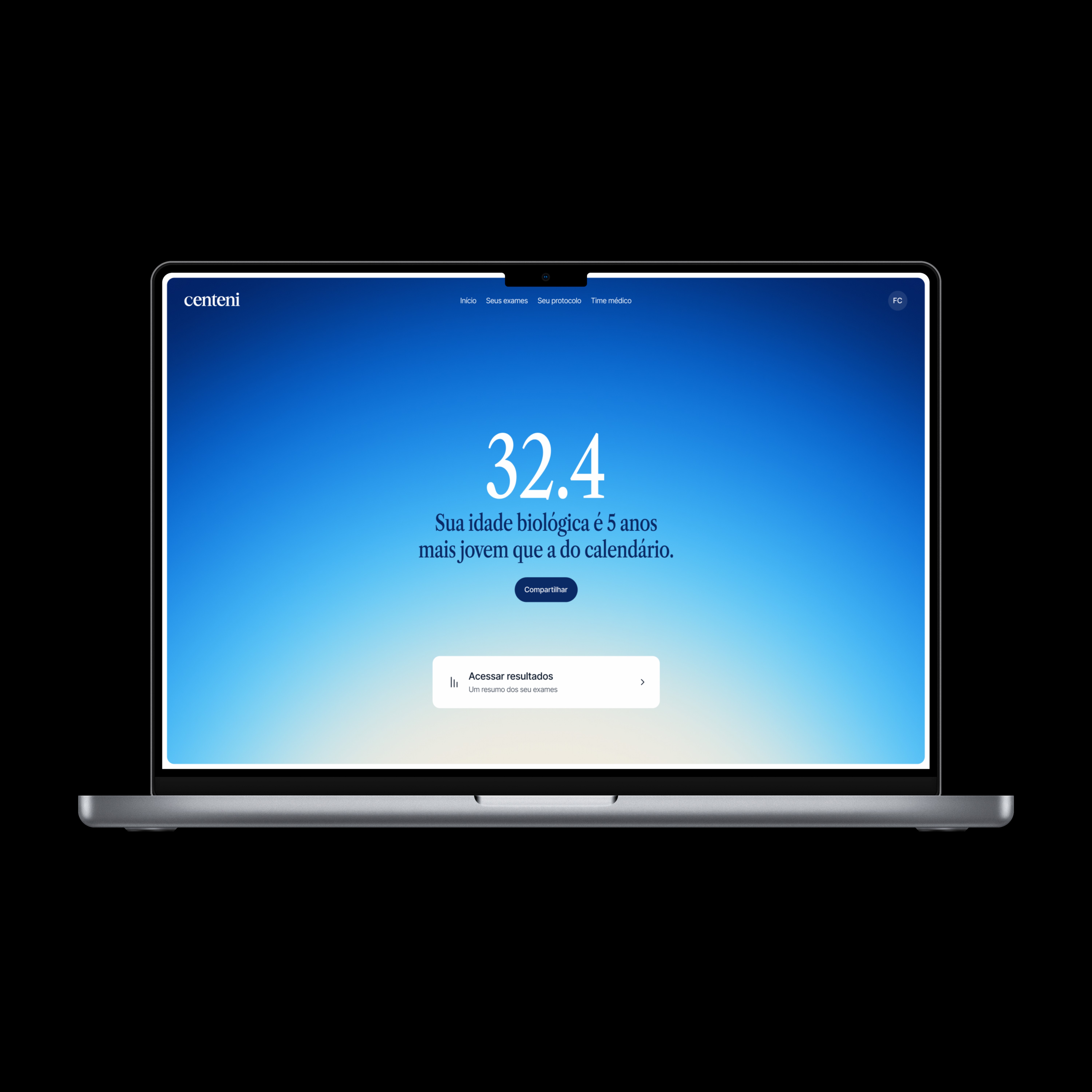
Home screen – displaying biological age.
The exam results screen was where I iterated the most. My first solution was a donut chart. It made sense: it's the most common format for representing proportions. But it looked like a corporate BI dashboard, not a longevity product. I scrapped it and kept iterating until I landed on a bar chart where only the top has color: a thin horizontal line indicating optimal, normal, or out of range. The reading is immediate just from the height of the bars. The elegance comes from chromatic restraint.

Exam dashboard – displaying test results.
Each biomarker has its own page: historical timeline, current value, reference range, and a plain-language explanation of what the marker is, why it matters, and what makes that number fluctuate. Content written with the medical team. Structure defined with the PM and doctors.

Exam dashboard – biomarker detail view.
"It made me want to take even better care of my health." — patient during the pilot
That quote isn't an interface review. It's evidence of behavior change. The design had worked not as a visual layer over medical data, but as an education system that generated agency in the patient.
The protocol is where the patient reads what their results mean as a system. Not marker by marker, but by cardiometabolic health, hormones, metabolism, and toxins. Structure defined with the PM and medical team: "How am I doing," "What to prioritize," "What to do." Three questions no lab PDF ever answers.

Health protocol – displaying medications and supplements.
Three clinical cases sum up what the product does when it works. A 67-year-old man with low energy: tests revealed clinically low testosterone, replacement therapy started, energy restored. A 31-year-old man with burnout and over 25 kg of weight gain: diagnosis revealed metabolic dysfunction, not a lifestyle failure. GLP-1 started, 13 kg lost in 90 days. A 36-year-old woman, an amateur athlete with persistent fatigue incorrectly treated with testosterone: the data revealed dangerously elevated testosterone from unnecessary treatment. It was stopped. IV iron restored her energy and avoided long-term hormonal risk.
The number that mattered most wasn't an engagement metric. It was behavior. 79% of patients changed something in their own lives after receiving their protocol. The 36-year-old woman's case sums up what this product can do when it works: the interface didn't cure anyone, but it made it possible for the right doctor to see the right data and make the right decision at the right moment. That's the work design does here.

Exam dashboard – displaying test results.