Building a Digital Bank for 6 Million People
Company
Banco Pan
Position
Senior Product Designer
Industry
Banking
Platform
Mobile
I was working at Agibank when the head of product moved to Banco Pan, freshly acquired 100% by BTG Pactual, and brought the head of design along with four other designers. We arrived in São Paulo to find a structure built from scratch: more than 60 developers and four designers, responsible for UX, UI, and research. We brought with us the methodology we'd built at Agibank: prototype fast, get out on the street, test with real people. Pan demanded more: design and engineering working side by side, because the deadline wasn't moving.
The challenge wasn't digitizing a bank. It was building a product that someone with low financial literacy could operate on their own, with one hand, while waiting in the bus line. No manual, no tutorial, no help.
Banco Pan always knew who its customer was: the worker with payroll-deductible credit, the buyer of their first financed car, the family that needed credit but had no bank account. More than 120 million Brazilians the traditional financial system preferred not to see. The BTG acquisition opened the window. Our job was to build the product that would walk through it.
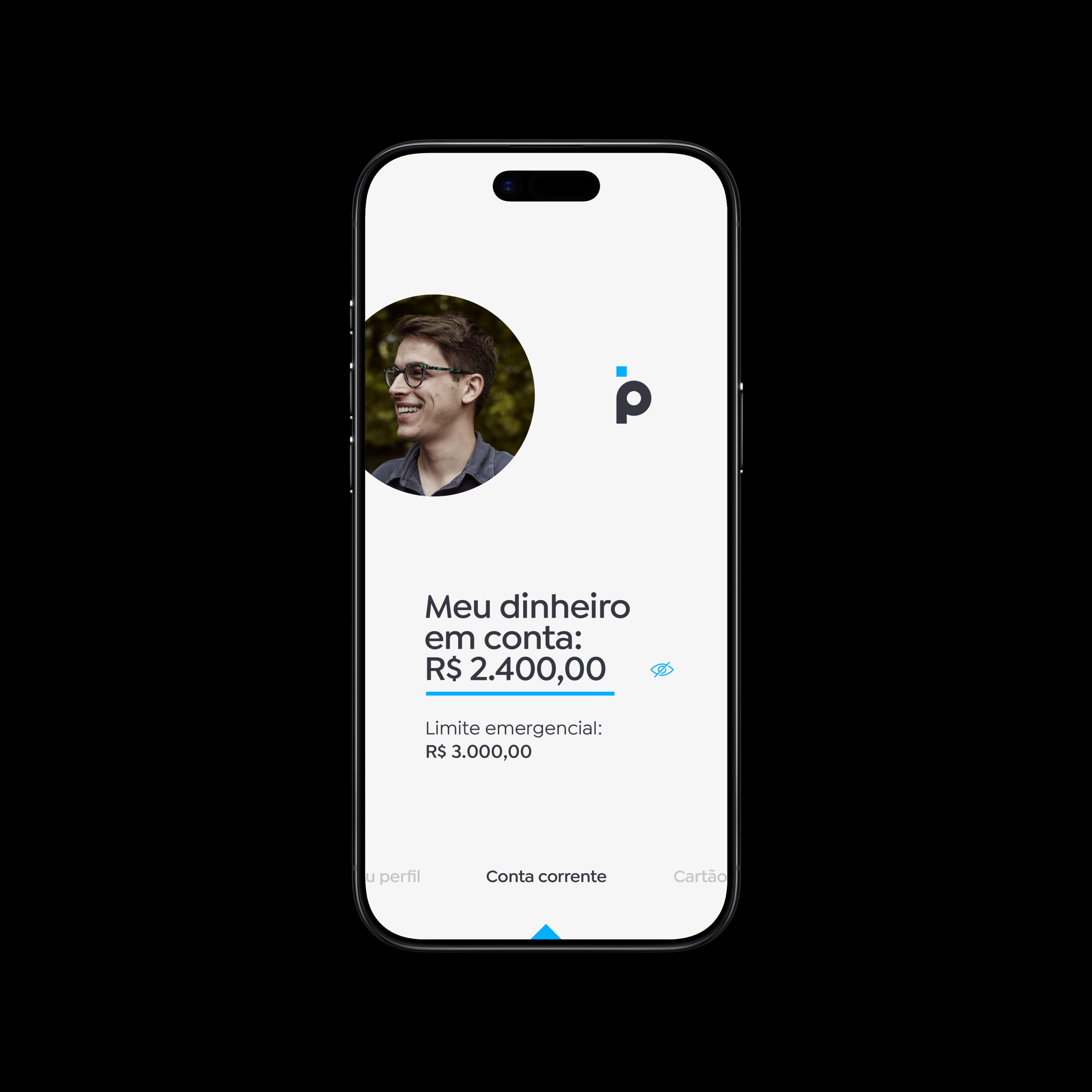
Banco Pan app – Home screen.
More than 300GB of files, 130 hours of video, 70 hours of audio, 120 qualitative interviews, 39,532 quantitative responses. Every design decision that followed was anchored in something a real person told us or did in front of us. Thiago, 22, told us everything gets tracked down to the last detail: income, expenses, even a piece of candy. A level of financial discipline I'd rarely seen even among wealthier people. No bank had ever built a product that respected that discipline.
Ailton, 60, asked us with total seriousness: "What if the app disappears? How do I get the money that's on the internet back in cash?" That wasn't ignorance. It was legitimate distrust, built over decades of financial exclusion.
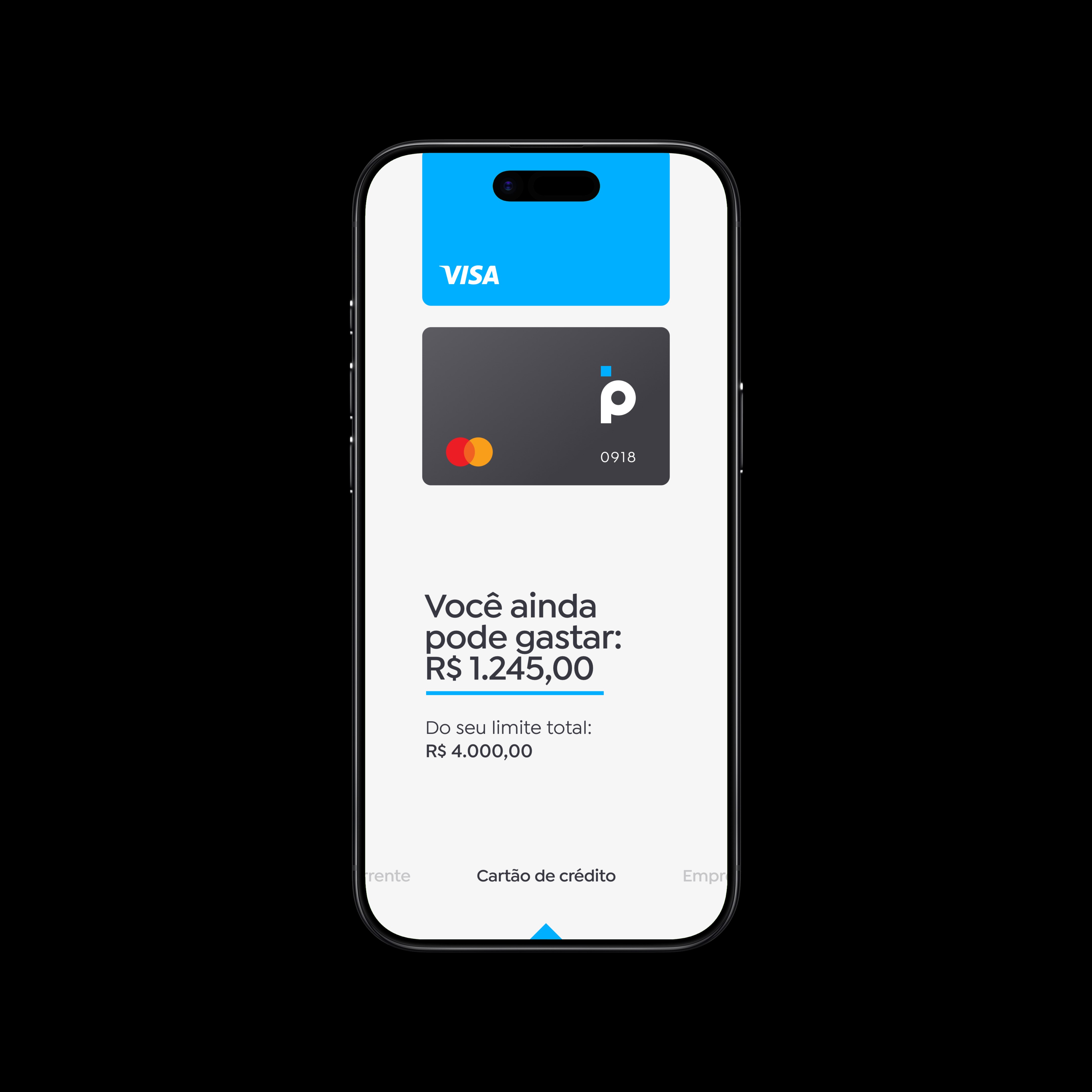
Banco Pan app – Credit card home screen.
93% of interviewees had a smartphone and used apps. The audience was ready for digital. Digital had simply never been built for them. That understanding wasn't an academic exercise. It's what kept us from designing for ourselves.
The mission pulled in two opposite directions at once. On one side: an experience so simple anyone could use it with no instructions. On the other: a contextual sales engine, a product that surfaced credit, cards, and loans at the exact moment the customer needed them, not when the bank wanted to push them. Simplify too much and the product becomes a soulless account, unable to generate revenue. Complicate it too much and the customer abandons it on day two. Our bet was that simplicity and commercial sophistication aren't opposites. They're the same goal, seen from different angles.
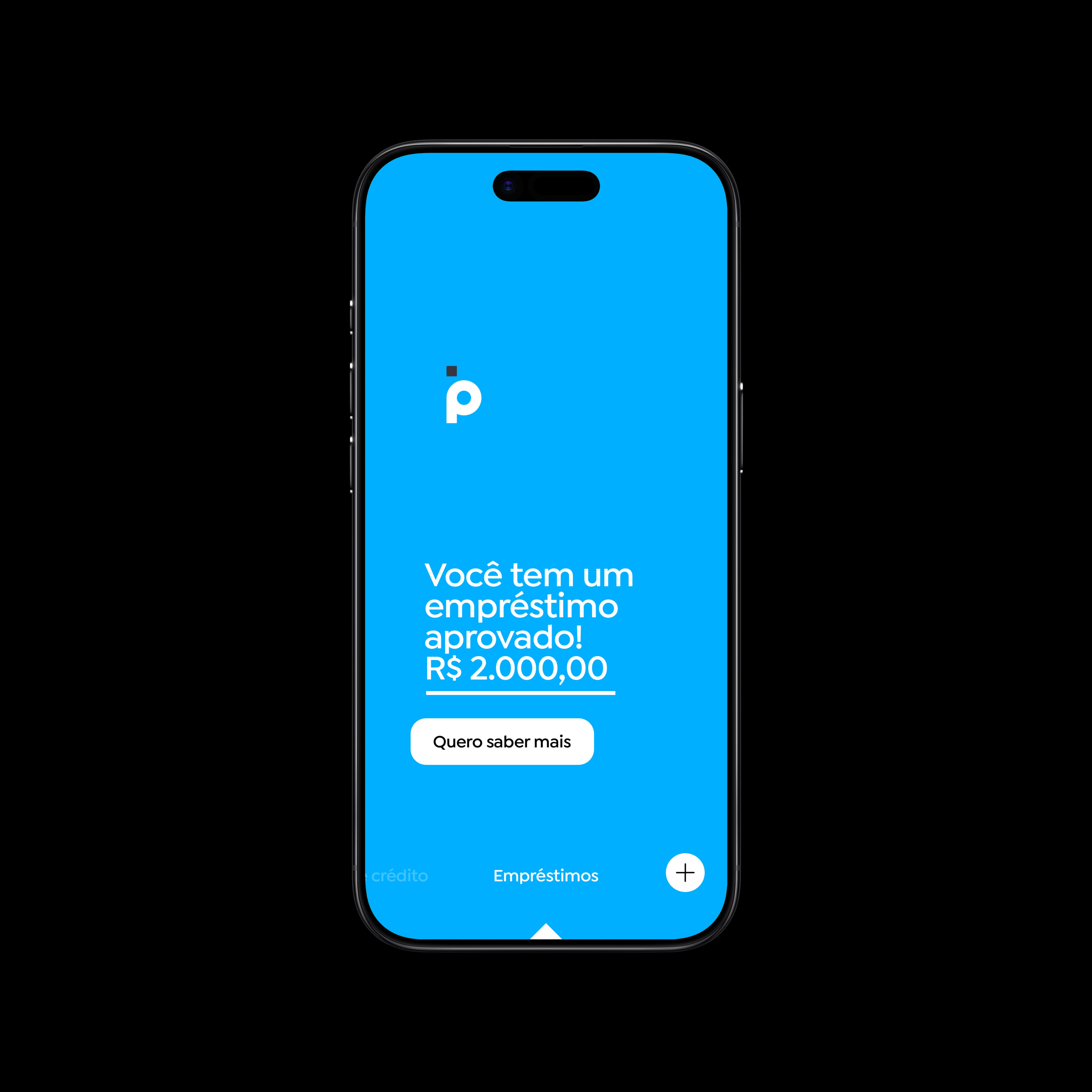
Banco Pan app – Loans home screen.
To avoid making these decisions by gut feeling, we structured the process into two layers. Strategic research gave us the foundations: real personas, value proposition, opportunity map. Tactical research gave us the instruments: navigation logic, interaction mechanics, visual comfort for this specific audience. The distinction matters: strategic research tells you who the people are. Tactical research tells you whether the solution you designed actually works in their hands.
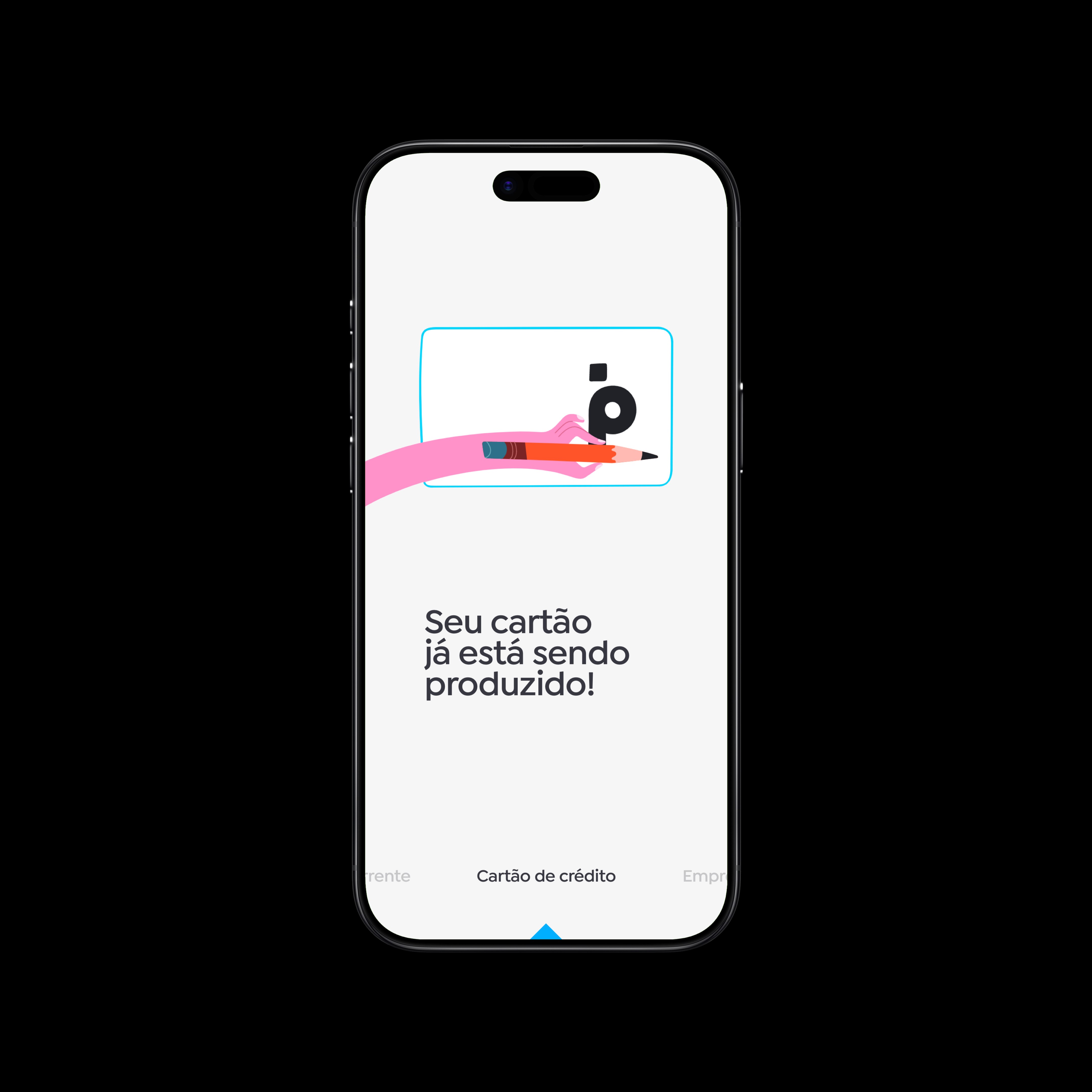
Banco Pan app – Credit card home screen showing credit card usage tracking.
We built 12 navigable prototypes before hitting the streets. Variations in architecture, information hierarchy, visual language. Each one defended a different hypothesis. Horizontal navigation between products worked with no explanation needed: people swiped between checking account, card, and credit as if they'd always known they could. But one thing emerged that none of us had designed: when people wanted to dig into a product's details, they scrolled up. A gesture the user invented. That we incorporated.
Documentary video – Usability testing to validate the Banco Pan app framework.
Five principles guided every decision. We brought a methodology from Agibank and expanded it: psychodynamics, Gestalt, semiotics, cognitive ergonomics. And we decided from the start: none of them would be optional. Giving up any one of them would mean giving up the quality we wanted.
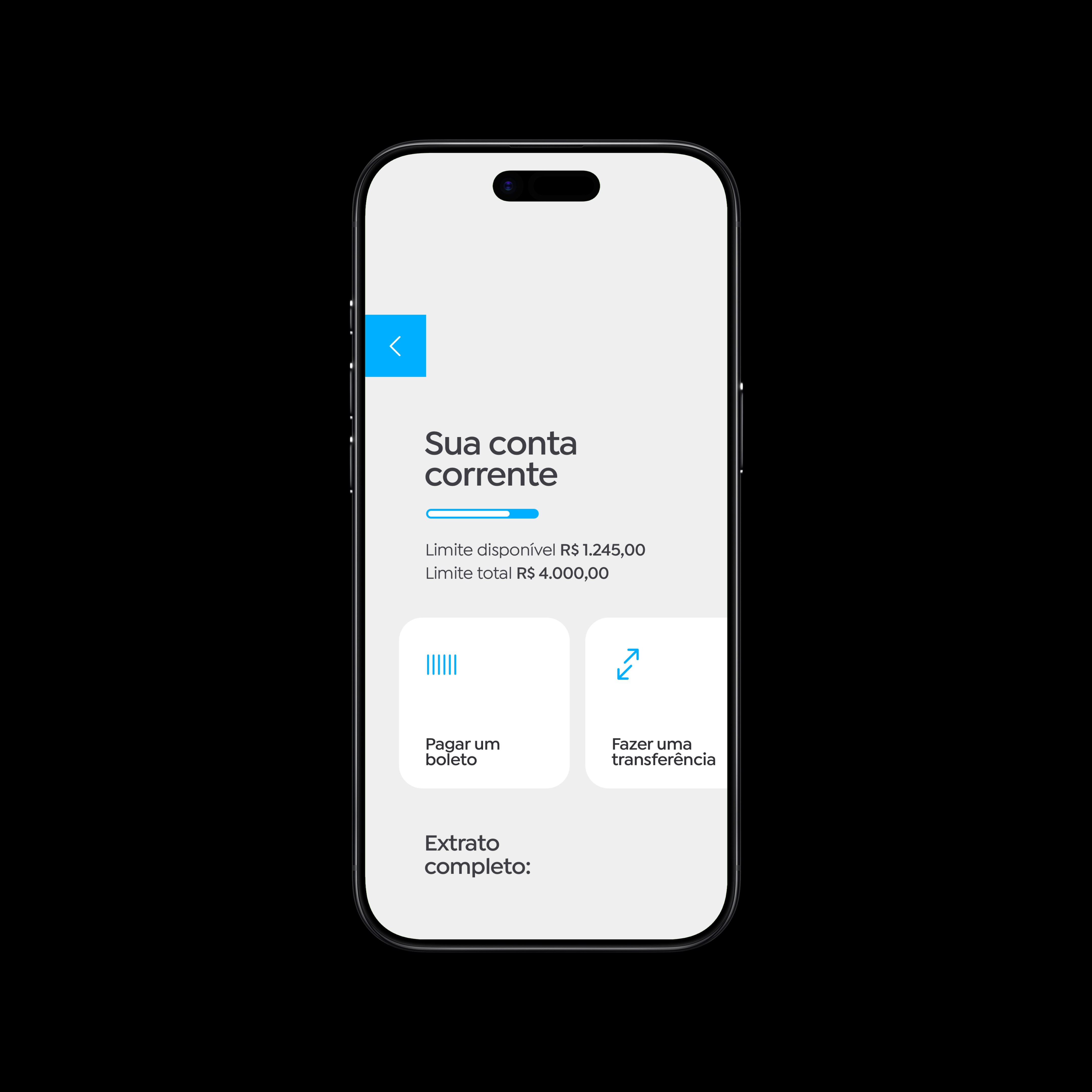
Banco Pan app – Checking account home screen.
We didn't cut scope. We cut execution quality. A lot shipped with issues, and the worst was loading time: 12 seconds from login to the home screen, in a market where the standard was under 3. I put together a comparative presentation for engineering showing Pan side by side with competitors. We assembled a task force, analyzed every request the app made on load, reviewed the security architecture. We got it down to 7 seconds. Not perfect. Good enough to keep moving. After launch, we set up a formal QA structure: document every bug, prioritize by impact, fix systematically. That's what taught us speed and quality don't have to be opposites, as long as you have process.
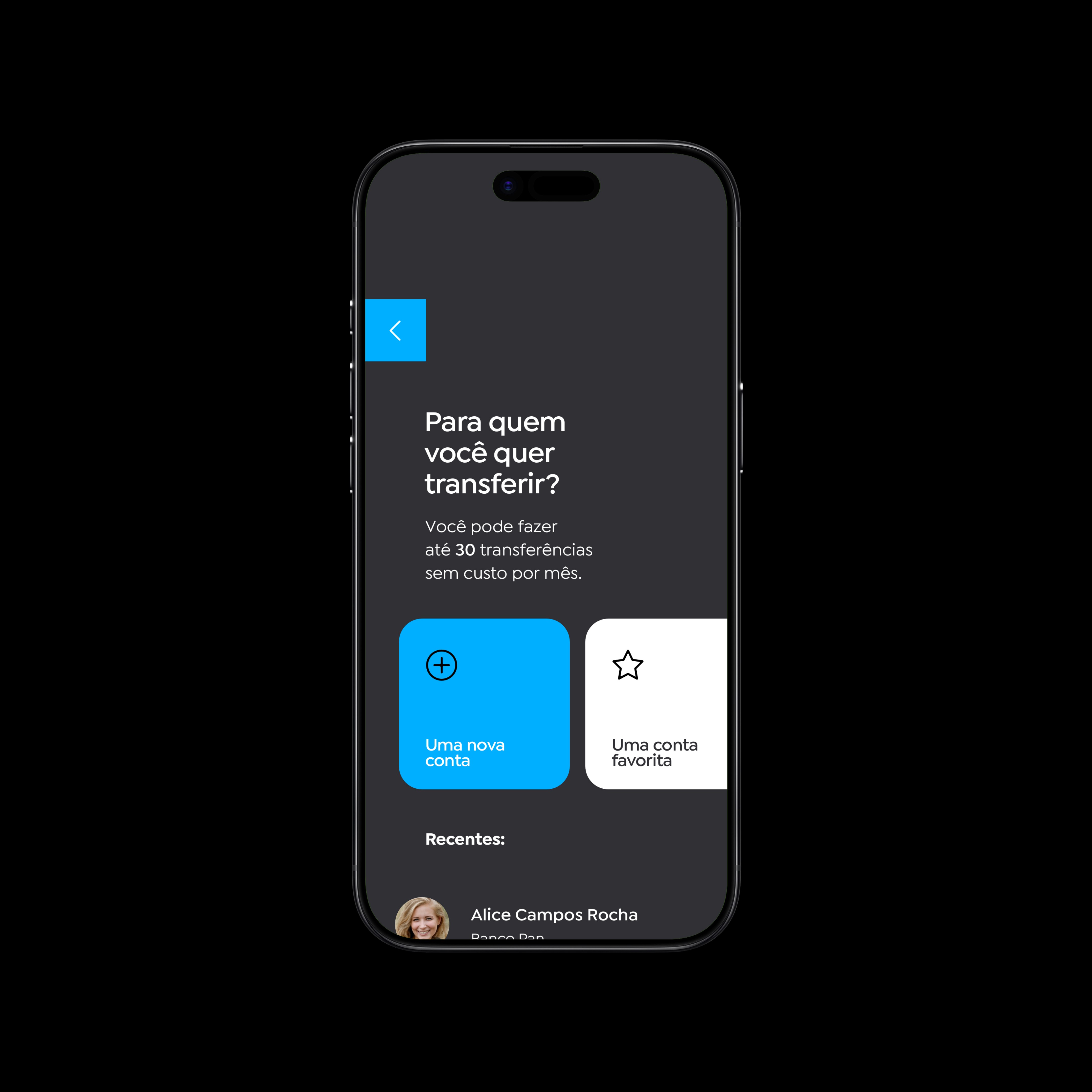
Banco Pan app – Bank transfer screen.
We launched in Q1 2020 with 1.3 million customers. A year later, the product had 6 million. 378% growth in 12 months. A 4.3 average rating in the app stores. By the time those numbers came in, I was already at a different company. I found out through the news. I felt a pride I hadn't felt before. Not for myself: for the team. For 12 months, those four people were completely committed to a delivery no one knew would actually work. We worked under tight deadlines, with bugs, with pressure from every side. And the product survived all of it. It grew without us. That's the definition of good work: when what you built no longer needs you to exist.
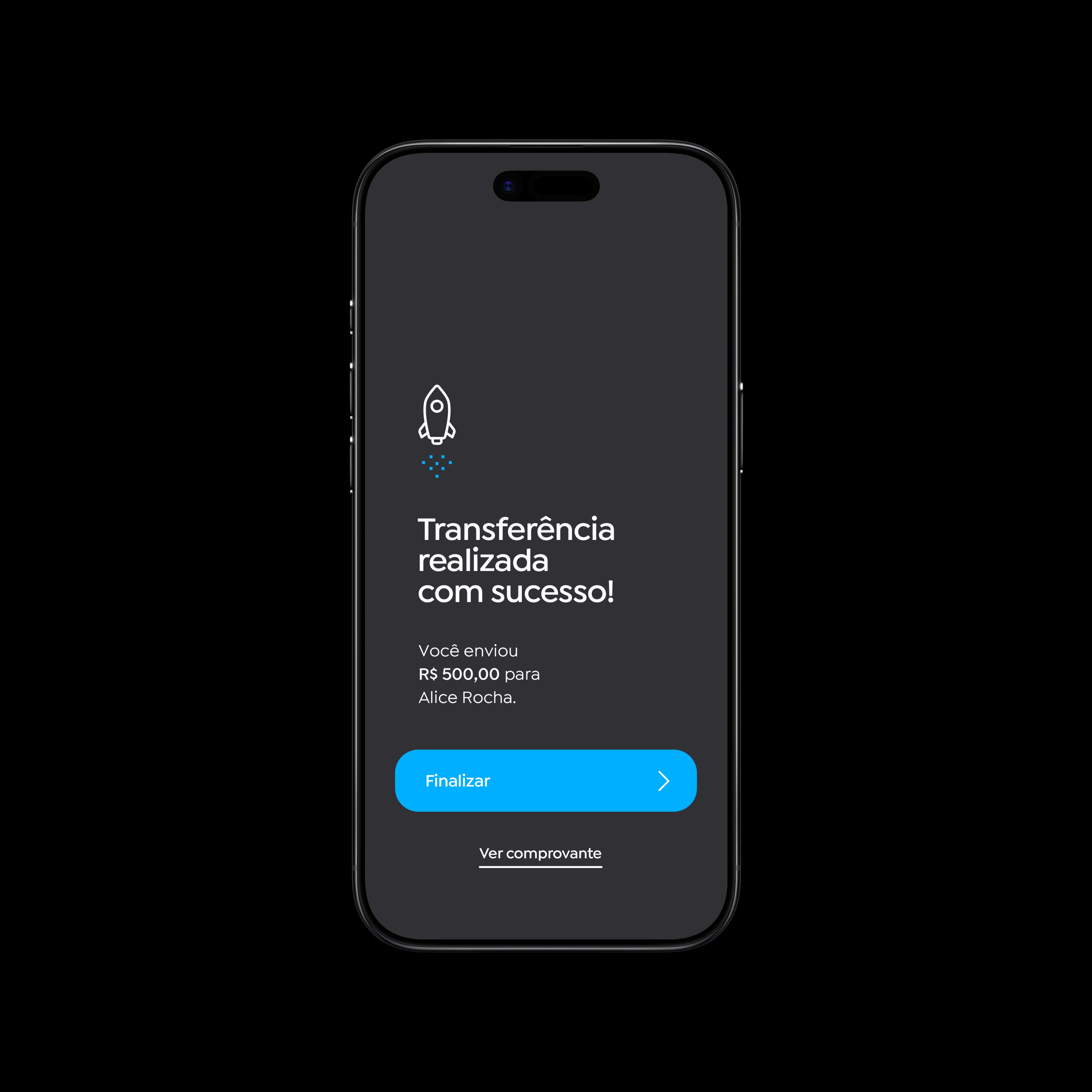
Banco Pan app – Successful bank transfer screen.
←Homepage