What Worked in Brasília Didn't Work in Contagem
Company
Lemon
Position
Senior Product Designer
Industry
Energytech
Platform
Brand
Mobile
Lemon is an energytech company that leases solar panels installed on remote farms: the customer's energy gets fed into the grid, and they receive a discount on their electricity bill. In Brasília, the product sold itself: the audience was sophisticated, the environmental argument was persuasive, and Lemon grew with that wind at its back. When Ambev came in as an investor and the company launched a pilot in Contagem to serve bars and small pubs across Greater Belo Horizonte, the audience changed completely.
The symbol was a smiling lemon with a plug. For a bar owner who'd never heard of distributed solar energy, seeing that mark and understanding it was going to touch their electricity bill, the bill that can't be late, the service that can't go out, was a leap of trust no smiling lemon could carry. The English name and the total absence of any visual reference to the electrical sector compounded the problem.

Before: a wordmark paired with a lemon that looked more like a happy electrical outlet.
The first decision was about the kind of trust the symbol needed to convey: not the trust of a friendly startup, but that of a provider of an essential service. The new symbol depicts a sun and three pinwheel blades, two sources of green energy, built from a solid, modernist geometry. The reference point was European utility companies from the 1960s and 70s: logos that communicate industrial seriousness with no need for contextual explanation.
Lemon brand construction grid. A geometric structure built to ensure balance, proportion, and consistency.
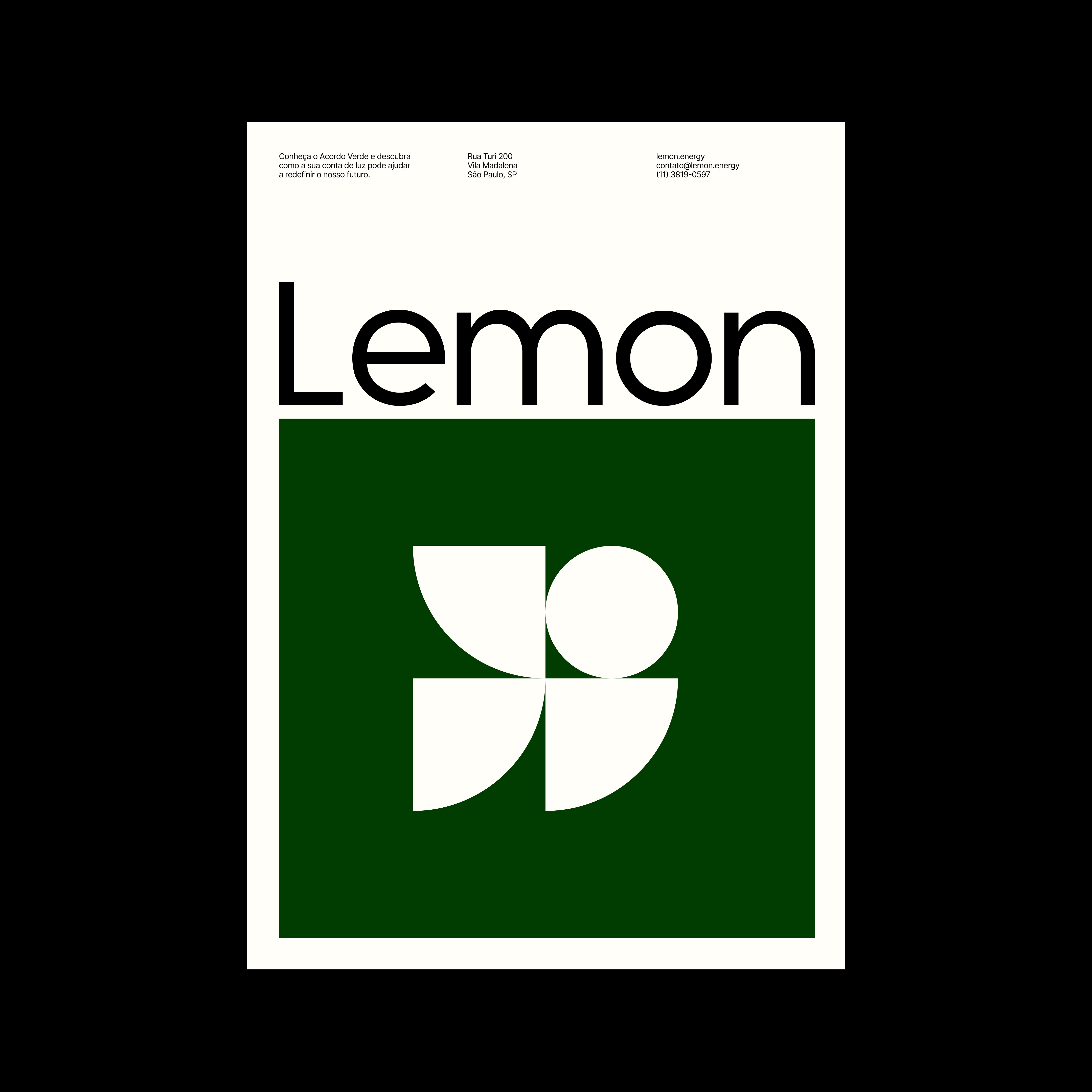
Poster created as a key piece of Lemon's visual identity system. It shows how typography, symbol, color, and composition work together.
Lemon Brand Guidelines. Documentation of the visual identity system, defining typography principles, color palette, and application rules.
The ambition went beyond swapping a weak symbol for a strong one. We wanted the symbol to function like a certification, something a business owner would display in their storefront with the same pride as a B Corp certificate, signaling: smart energy is used here. The symbol also needed to attract talent: to communicate that Lemon had grown beyond its three founders in Brasília. The wordmark's typography followed the same principle: weight, spacing, and presence calibrated so Lemon read as an energy provider, not a startup.
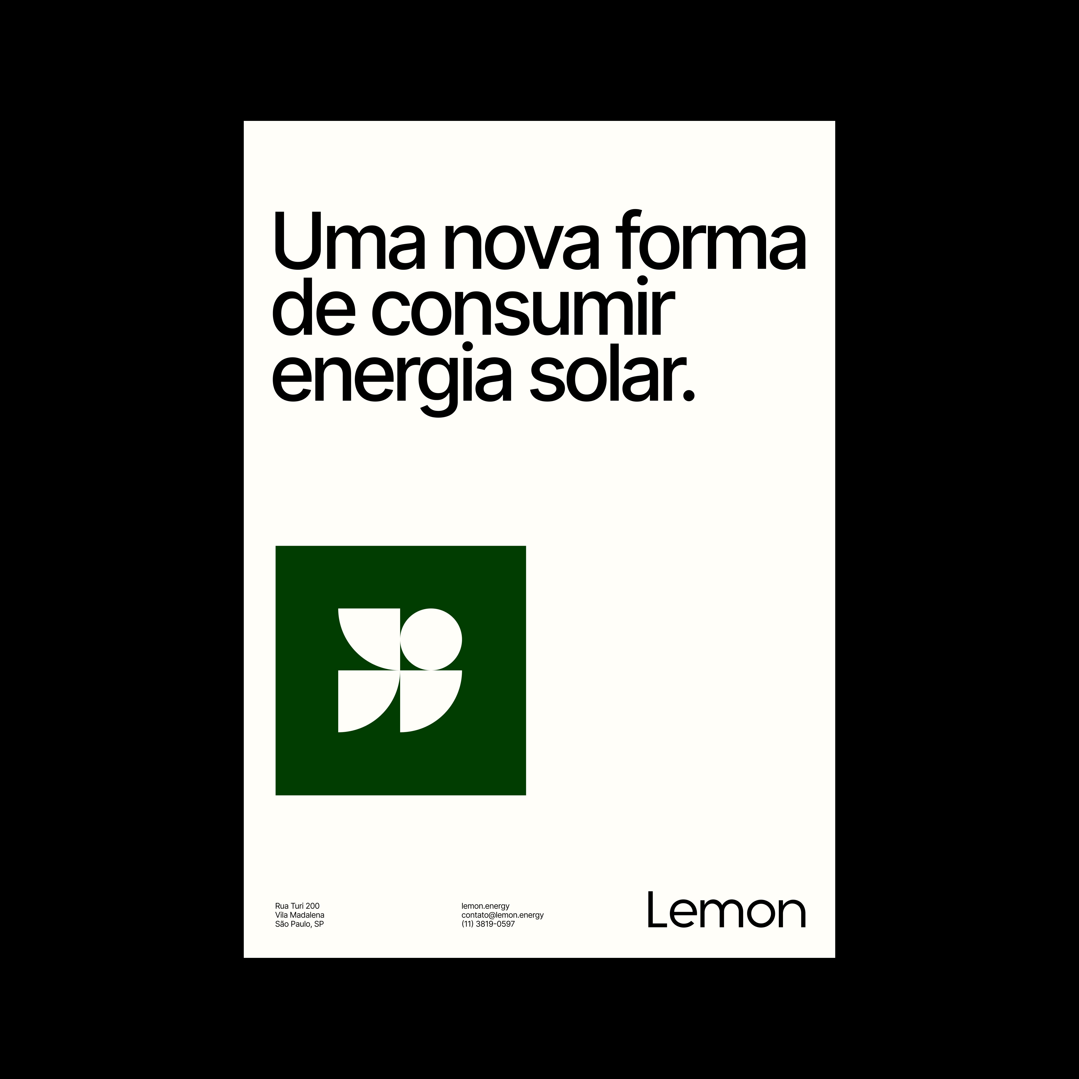
Poster variation following the brand's grid system. The composition uses the same proportional logic.
The symbol and the sign-up flow were designed together. The app's iconography, sober and solid, derived from the same geometric logic as the symbol, signaled every step of the journey with no ambiguity.
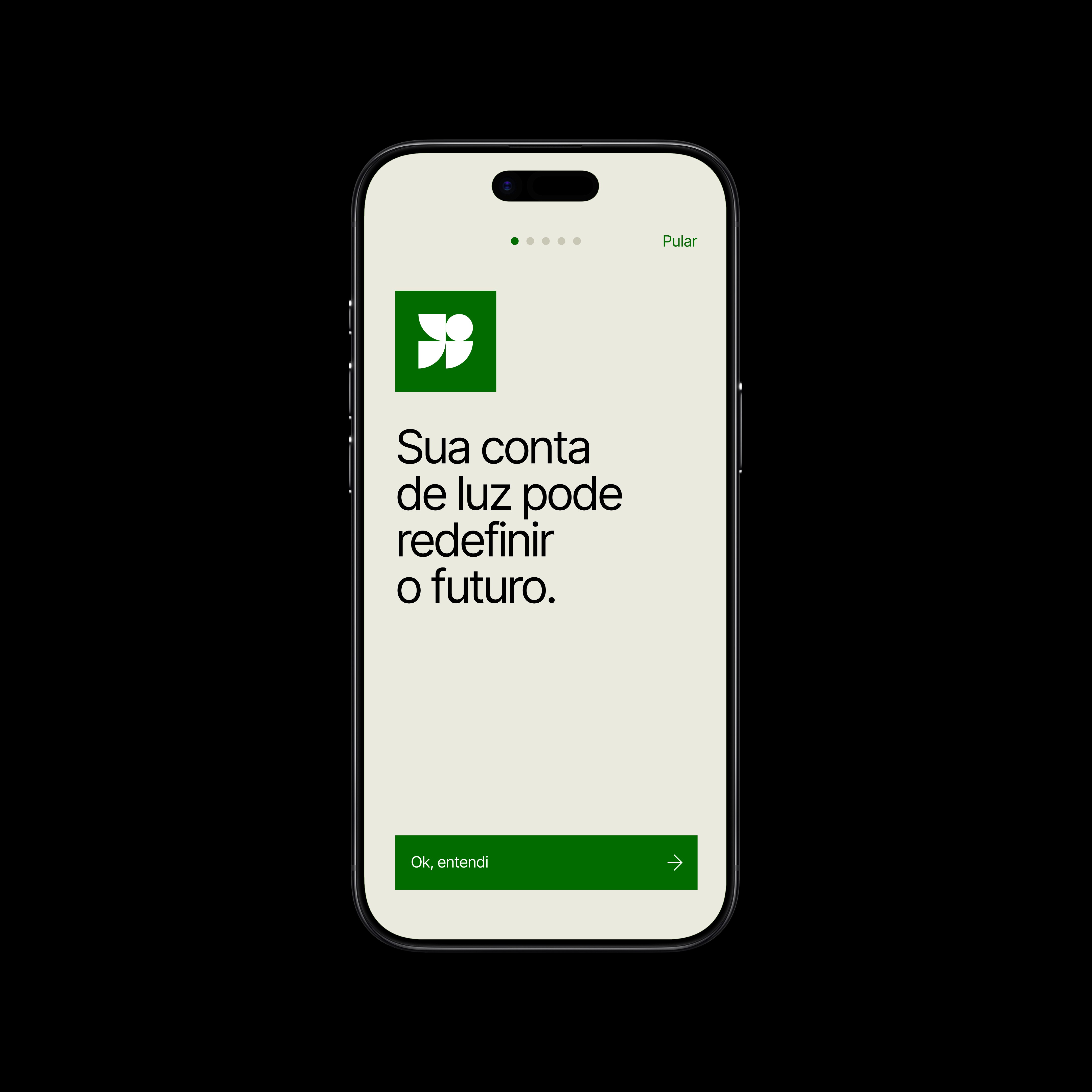
Lemon's visual system was carried into the product itself. Typography, colors, icons, and composition share the same logic as the identity.
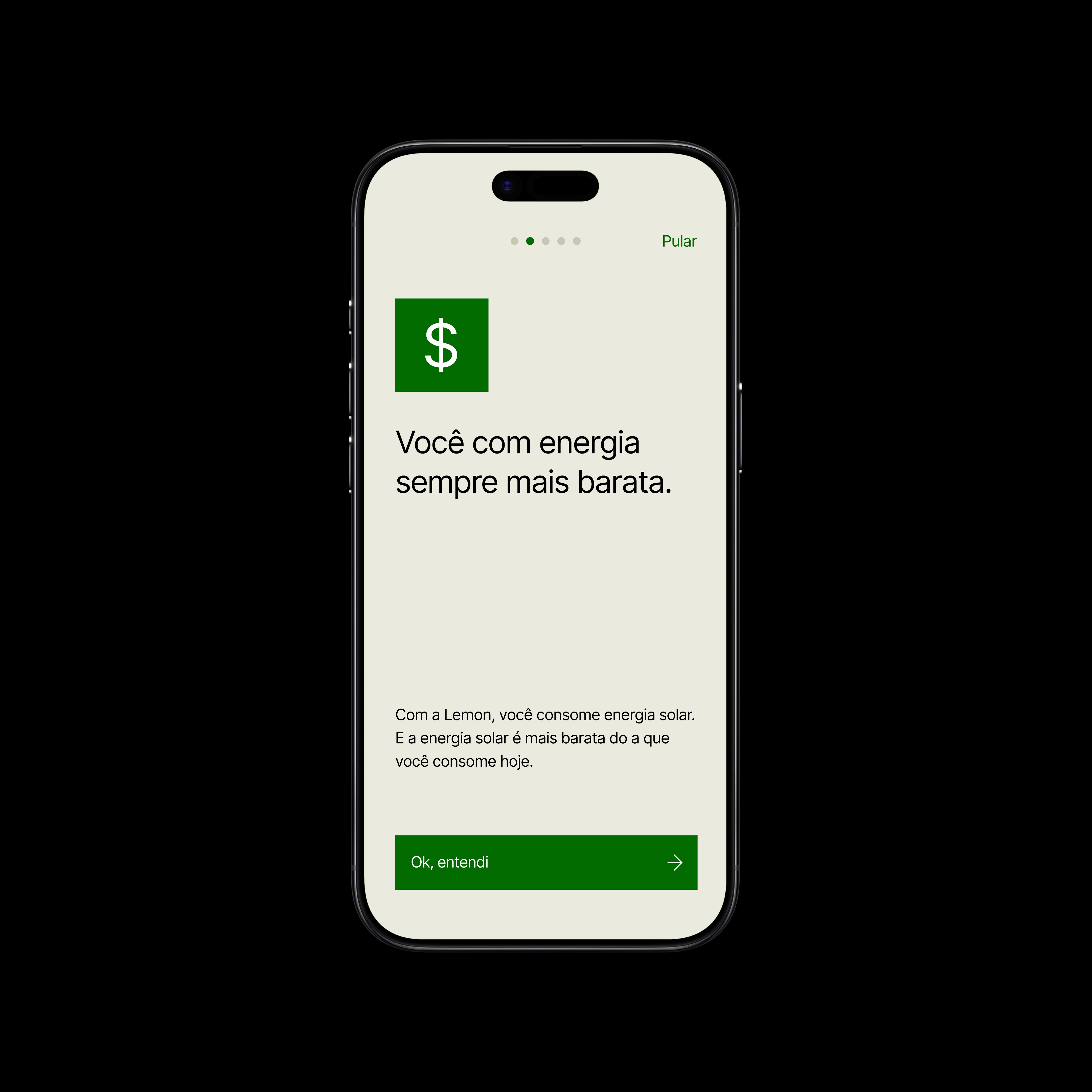
The visual identity also guides the product's communication. Icons are presented within the brand's signature green square.
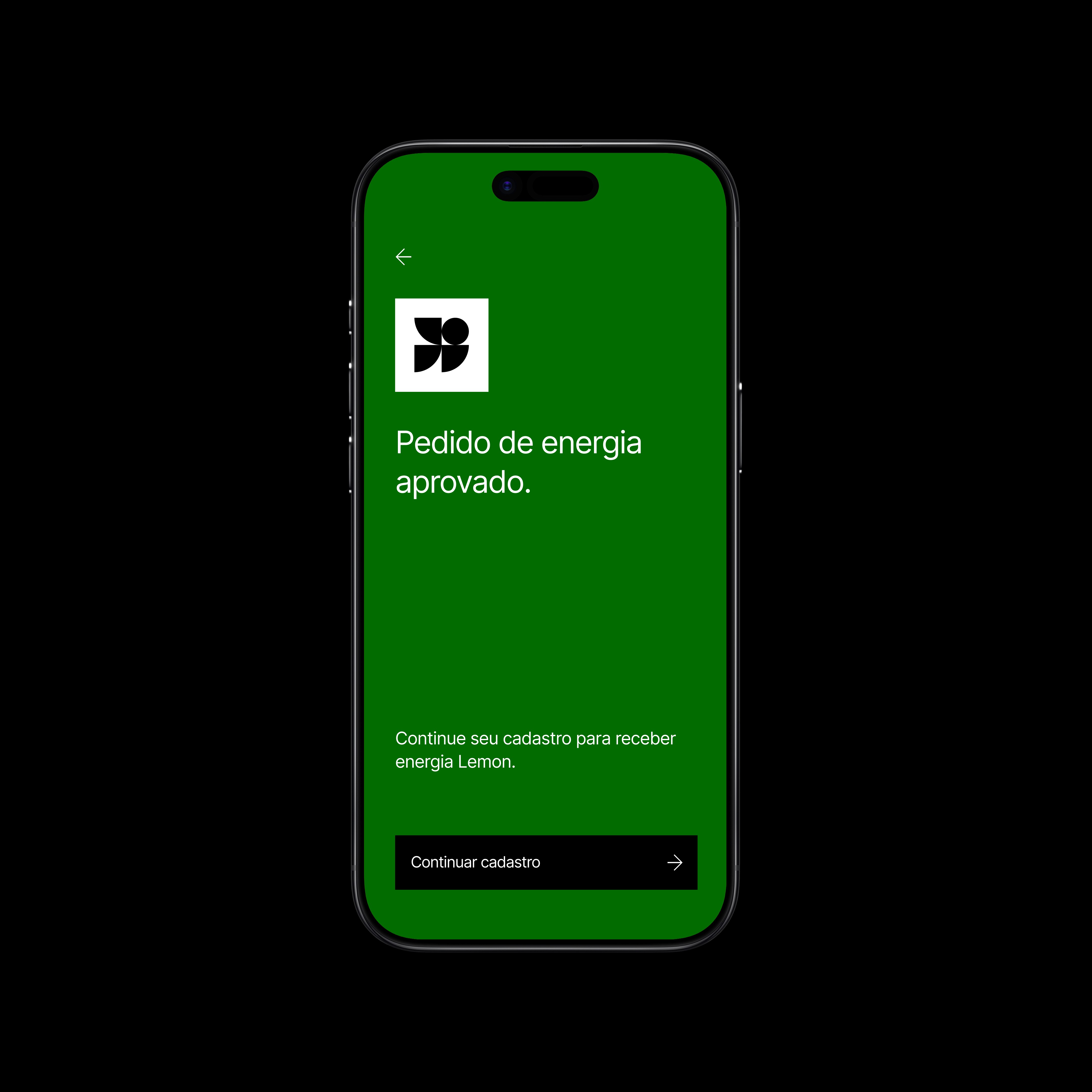
The visual identity stays with the user through to the end of the flow. The predominant use of green signals approval.
The screen that took the most work was the one explaining the billing model: with Lemon, the electricity bill splits into two, and that was the exact point where most prospects got stuck, confusing "two bills" with more complexity, when it actually meant less cost.
"The solution was a bar chart. Two blocks side by side: yellow on the left, green at the bottom right. There's no explanation longer than what the eye already understood."
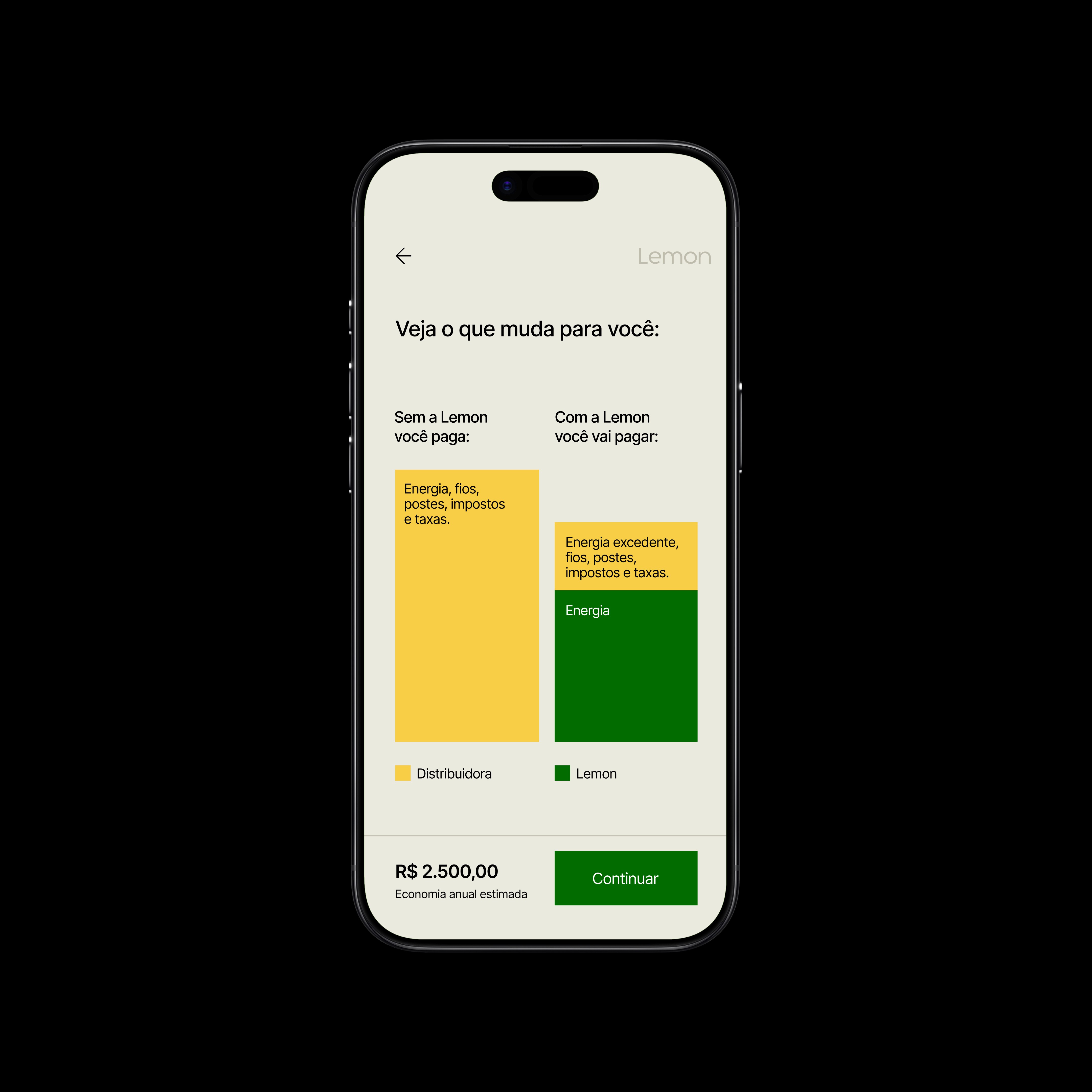
Comparative chart built into the sign-up journey to communicate how the electricity bill's costs are split.
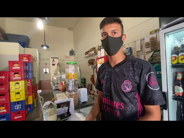
With the symbol finished and the flow designed, I traveled to Contagem. The goal was to put the phone in bar owners' hands and observe, without intervening, without explaining, what happened when the product tried to sell itself for the first time. What the research revealed was a reversal that reorganized the priorities of the entire project: in Brasília, the central argument was sustainability; for the business owners in Contagem, the environmental argument didn't move the needle at all.
Documentary produced during field research in Contagem (MG), capturing interviews, observations, and usability tests that shaped Lemon's branding, product, and communication decisions.
Sustainability didn't disappear: it became a secondary benefit, a bonus that comes along with the financial decision. But the headline became the money the business owner stops spending. Lemon stopped being an environmentally-driven company that also happens to save money, and became a company that saves money and, as a consequence, does good for the planet.